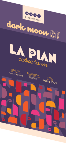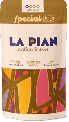
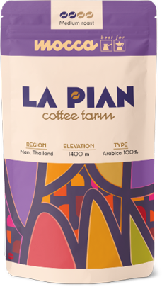
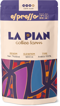
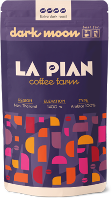
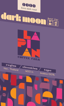
The packaging design draws inspiration from tropical colors and the rolling hills of the farm’s location in Chiang Mai province. It also subtly references the patterns and textures of local hill tribe textiles. The brand is designed to feel metropolitan and energetic—eschewing muted coffee tones in favor of bold, multicolored styling.
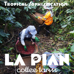

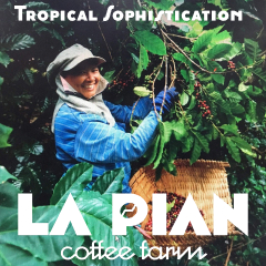
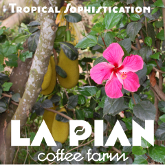

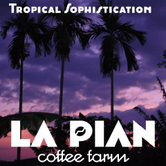
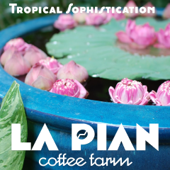
Social media templates extending the brand’s visual language
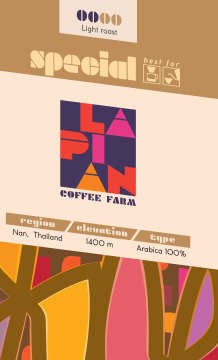
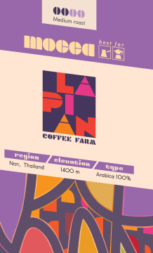

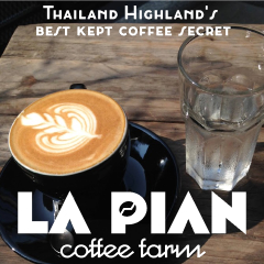
Alternative version of design and logotype


The redesigned La Pian coffee farm logo has a cosmopolitan character and influenced by Art Deco and Bauhaus typography.